Thursday 28 August 2014

Destination Inspiration tag

Hello everyone
A few days ago I showed an extensive step by step over on the A Vintage Journey blog. Part of that project was a tag, but because the post over there was getting so long, I promised I would show how I put the tag together here on my own blog, so here goes:
The techniques here can of course be used for all sorts of different projects.
I started by covering a size 8 tag with Tim Holtz Tissue Wrap.
I crumpled it in places on purpose to add more texture. Next I added further textures by pushing Wendy Vecchi's texture paste through one of Tim's layering stencils and then added colour, using Distress Paints:
The colours I used were Antique Linen, Weathered Wood and Brushed Corduroy.. Please note, the Tissue Wrap resist Distress Inks quite a bit, so use something like paint or Archival inks. Once the paint is laid down, you can deepen the colours with Distress Inks and or Archival inks, that is what I did next:
Because the tag is part of a larger project, I wanted it just for adding a sentiment. I decided to add interest by using different fonts. I put my sentiment together by cutting words from a stamp from the Stuff to Say and Way with Words set. I love how different fonts can work together like that.
The word begins was put together with little letter tiles from a Prima paper. Courage was spelled out with the little letter labels.
I added a vocal point to the tag with the little die cut heart and the word courage from the chit chat stickers. More depth was created with the help of some shadow, added with the Black Soot Distress marker, both around the heart and the words.
Here you can see how the heart fits inside the pocket that is part of the main project. If you have not seen it yet, you can find it HERE.

Thanks for visiting like always and don't forget to have courage to let your imagination take you to great places, creative or otherwise.

Tuesday 26 August 2014

For All Your Truckin Needs for the Artistic Stamper

Hi everyone and welcome.
After yesterday's endless post for A Vintage Journey, and another one for Paris Assembly today just a a sneak peek for a a quick and easy project over at The Artistic Stamper.
If you want to see more, all you need to do is click here.
Thanks for visiting and taking the time to look
hugs

Monday 25 August 2014

Paris Assembly


Thanks for visiting, possibly for the second time. Details of the project below this one can, be found at A Vintage Journey

Having been away for most of July and a good chunk of August, I have been unable to play along with the Compendium of Curiosity challenges, so this time round I was determined to join in again. It's challenge 9 already, how time flies... I am sorry also to be posting twice on one day, times are so busy.
Here is my second make, I just had to fit it in quickly:

This time round, the Curiosity Crew are  playing with those cool Sizzix Alterations Framelits!  Tim explains this technique on page 63 in  A Compendium of Curiosities, Vol.3, for the details, you will have to check there.

I am lucky enough to own a few of these sets but for this challenge decided to play with the French Flight one. As the Frilly and Funky challenge blog are running an ATB challenge right now  and are doing a blog hop together with Eileen Hull's Art with Heart challenge where the theme is anything goes, I thought I'll kill 3 birds with one stone (well not really, I would never kill a bird), but you know what I mean, so as you can see, I made another ATB.

I cut the block from thick black card. Next I created my panels, using one of my favourite collage techniques. Below I'll show a quick step by step:
1.Cover your substrate with scraps of paper, I used various bits from Tim Holtz's ephemera and papers.
2. Use a stencil to add texture, I used Wendy Vecchi's Crackle Texture Paste and Tim's Harlequin stencil, then add a thin watered down layer of Gesso. Wipe away some of the gesso using a baby wipe so parts of the papers come through again. I actually love how it looks now, and could have left it, but on this occasion took it a bit further:
3. Adding colour, using Distress inks, further collage elements and some of the stamped and die cut framelets,  after all that is the theme of the CoC challenge and finally adding shadow with Distress Markers..

Below you can see what the other sides finished up as:
This is going to be the front panel, I used 3 different stamps of the framelets set.
One of the sides

The other side.
The lid, using another one of the framelits.

For the Eiffel tower I stamped the image twice and cut it out with the matching die. I then cut loads more, both from Kraft card and corrugated card and glued them all together until the tower was fat enough to stand. I then glued it down on a large circle die cut with some greenery and flowers.
Below you can see how fat the tower is, it's actually completely free standing.
I then put the two things, tower and block together and that was it. Originally my idea had been to put the tower on top of the box, but it looked kind of weird so in the end I solved it like this. I fancied the lid of the box up a bit still by adding a piece cut with the Tim Holtz Pediment die and embellished with a little paper clay ornament which I had painted black with Black Soot DP. I high lighted the raised bits with Treasure Gold.
Hope you like it, - I had great fun making it. The Compendium of Curiosities challenge is sponsored this time round by the wonderful people at the Inspiration Emporium. And of course the wonderful Tim and Mario are offering a big prize packet as well for one lucky winner.

I am linking this project to the following 3 challenges:


Have a great week

Destination Inspiration, layered collage...

Hello everyone and thanks for dropping by! High time to say a special welcome to all my new followers, it is wonderful to have you along for the journey!

Today it is my turn to post an inspiration tutorial on A Vintage Journey. I created a tutorial on how to do a layered collage for this tag card:
There is a collage on the inside too as well as a tag, so if you want to see more and get a step by step on how I built it al up, all you need to do is click here.

Hope you'll take the time to look and tell me what you think.

Meanwhile, thanks for dropping by here and have a great week ahead!!

Sunday 24 August 2014

Tim's August tag

Hi everyone and welcome to all of you, but specially my new followers, thank you for deciding to follow along here!!

It's not often I publish in the middle of the day, as most of my posts are scheduled for either mid night here in the UK or early morning. This for once is an unscheduled post, fresh from the crafting table so to speak....
As the title suggests, it's my take on Tim Holtz August tag, though I have to confess, I made it a few days ago, but only now found a minute to blog it. Just as well, as August is speeding by at a horrible pace.

I'm keeping this short(ish) as all details can be found on Tim's Blog.

I followed all his techniques closely, but changed the colours, stamps and the overall design as back in January I decided to work with two tags, a #8 on top of a #10, to give me more room to play with.

I used the new Gothic stencil and Wendy Vechhi's crackle paste though you can hardly see the crackle on this quite delicate stencil.
I used the butterflies from the new French themed Framelets set, but as they were getting a bit lost against the tissue tape and other background elements, I stamped the larger one again and fussy cut it, just to pop out a bit more.

The film strip, overlapping both tags to hold the overall design together a bit. I decided to put my pen nib on top of the strip. I did stitch it vertically, but it's hard to see from the photo. I also added some tissue tape and more stamping to the background tag.

A word band, high-lighted with Picket Fence DP (I don't have the newer word bands yet, they're on the wishlist).
Remnant Rub words on the vial label. Believe it or not, I had quite forgotten which words Tim had picked and then when I looked I had picked the same ones, must have been there somewhere in my unconscious mind.....
A Philosophy tag and the way I usually finish my Tim tags with the month at the top.


Well, that's it pretty much, - oh I did not use the speckle stencil as I thought it might get a bit too busy in the background, so I used the Spritzer tool for some very subtle spots instead.

Linking this to Tim's August Tag.

Thank you for visiting and have a great week!

Friday 22 August 2014

A Little Touch of Tim for a Vintage Journey

Hello everyone and welcome!
Today the lovely Alison from Words and Pictures has set a new challenge over at A Vintage Journey. The theme is "A Little Touch of Tim". What she wants us to do is create an ATC, and of course as A Vintage Journey is a challenge blog inspired by the work and techniques of the one and only Tim, it should be in true Tim style.
Here is what I made:
To be honest, this theme made me feel really nostalgic, as it was making and swapping ATCs that first got me into blogging and paper crafting, now many moons ago. It has been years since I last made ATCs, but it was fun to return to it, and so I made a little set of 3.
Here's a quick run down of how I went about it:
I cut 3 bits of card to just a fraction smaller than the obligatory 2.5 by 3.5" because I like to mount my ATCs to make them a bit stronger.
I distressed the edges and then added some texture through  Tim's Speckles stencil.
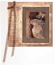
I had selected 3 photographs (vintage freebies from the net, all depicting groups of 3 children, I had 3 on my brain for some strange reason).
I added some bits of old book pages, tore around the photo and then adhered it to my card:
Next I used paints and inks, little collage scraps and some stamping, mounted it onto inked Kraft card until it looked like this:
I love how these ATCs are just perfect for adding little off-cuts and other scraps we all have flying around.

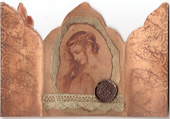
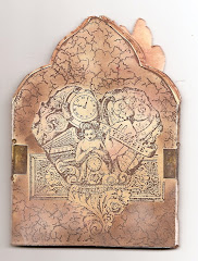
The other two were done in pretty much the same way.
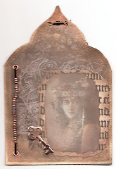
The little key on this one was a die cut, coloured with Antique Bronze Distress Paint and then, while the paint was still wet I added some Vintage Photo Distress embossing powder and some Ranger Antiquities Rust EP for the rust effect.
For this one I fussy-cut the children to show some more of the background, I gave the girl a little crown cut from a tiny bit of Tim's Industrious Stickers.

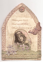
When I had completed all three I decided to create a Triptych with with the Sizzix/Tim Holtz Gothic Arch die, I love how it is just the right size to mount ATCs on. I cut 3 from...... guess what? The packaging of Tim's Stencils!. I then cut two strips of Kraft card to act as hinges and then cut three more from some Prima paper to act as backing and to hide the hinges.
It can fold together and be tied with a ribbon, the front was decorated with a smaller arch cut from another bit of Prima paper (all from the Time Travelers collection).
I did some faux stitching with a white pen and a butterfly cut with the new French Flight Framelits set; a couple of chit chat stickers finishes it all of.

Well hope you like this little touch of Tim. Make sure to hop over to A Vintage Journey to see the amazing ATCs my teamies have created, and we all hope you will play along. You could win a £10 voucher from Country View Crafts our wonderful sponsor or be selected as one of our "Pin Worthies".

Have a great weekend and stay inky!!

Thursday 21 August 2014

Garden Hanger for Calico Crafts

Hello everyone and thanks for dropping by here.
My turn to post on the Calico Crafts Blog, so just a little pre-view here I'm sorry to say.

I have been having fun playing with different mediums and crackle effects, if you want to find out more, all you have to do is click here.

Hope you'll take the time to look and let me know what you think.

Thanks for visiting like always and see you next time!

Tuesday 19 August 2014

Butterfly Birthdays

Hello everyone and lovely to have you visiting!
I seem to be in card-making mode right now, but then I have a lot of birthdays to make for in August...
I made two rather similar and fairly quick cards, here is the first:
I used the Tim Holtz layered Butterfly die with matching embossing folders for both cards. The base is a paper from the Prima Time Traveller collection.

I cut the butterfly first from Grunge paper and then from a small piece of a paper from the Finnabair Sunrise Sunset collection. I glued the two together and then ran them through the embossing folder. I inked and spritzt with some Walnut ink and when dry covered it all with Clear Rockcandy Distress Crackle paint. When the crack appeared I rubbed some Walnut Stain Distress Stain into the cracks and highlighted the raised bits with Treasure Gold. I also used one of the Shadow Press folders, though it is hard to see on the photos.
The sentiment is from the Tim Holtz Classic 11 set. I also added a piece of the Trellis die cut from Kraft Card.

The second one was done in a very similar way, using the same paper collection.

This time the butterfly was cut from 480 grms white card and coloured with a mix of Golden Fluid Acrylics and Distress Inks.
The butterfly was covered in Rock Candy Crackle again and the cracks highlighted with Walnut stain. I love how it took on an almost glass like appearance.
This time I fussy-cut some flowers from one of the other papers and mounted them onto the trellis die cut.
The word Congratulations was embossed with a Darice folder.

Well hope you like my cards, the first one is for an artist friend, the second for my sister in law, neither of them are into card making at all, so fingers crossed they will like them....
 Isn't it amazing how the month of August is just flying by? Thank you for visiting and hope you will find some time to do something creative!


Related Posts Plugin for WordPress, Blogger...

One World One Heart

Photo

FEEDJIT Live Traffic Feed

Birthday Card

Birthday Card
Just got a whole lot of new stamps from a brilliant place called the Stamp Smith. This is the image that I first saw on Docraft and really liked. I asked the friend who has used it in an ATC, where she got it. Well she borrowed it from a friend who got it from ebay as a one off. But.... it had a title. I googled the title, and hey presto found the site. They have great stamps and offer a really friendly fast service. I highly recommend them!

Gothic Arch Trifold inside

Gothic Arch Trifold inside

Back of Gothic Arch Trifold

Back of Gothic Arch Trifold

Gothic Arch Within the Heart

Gothic Arch Within the Heart

Gothic Arch, the Key

Gothic Arch, the Key